Histogram and boxplot
Institute for Environmental and Spatial Analysis...University of North Georgia
Contents
1 What is a histogram?
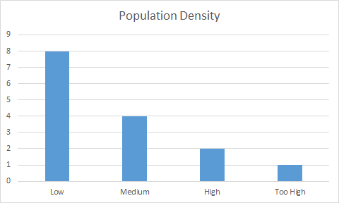
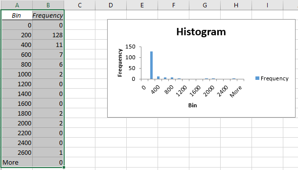
Have you ever heard of a histogram or seen something like this?
Statistically speaking, a histogram shows the distribution of data. There are data ranges or bins on the x-axis and count or frequency on the y-axis.
2 Bins
Bins in the histogram have an equal width or interval of data. They can be either numeric intervals or categorical classes.
3 Frequency
Frequency represents in each bin how often events occur or how many data points are found.
4 Drawing a histogram manually
- Sort data in an ascending order.
- Determine your bin width.
- Count how many data points fall in each bin.
- Draw a bar at each bin with the bin width as its width and its count as the height.
5 Exercise: Manual histogram
Original data
| NAME10 | PopDens |
|---|---|
| Lanier | 50 |
| Bryan | 66 |
| Appling | 36 |
| Rabun | 43 |
| Bleckley | 60 |
| Fayette | 535 |
| Jefferson | 32 |
| Seminole | 34 |
| Camden | 65 |
| Glynn | 136 |
| Polk | 133 |
| Morgan | 50 |
| Talbot | 17 |
| Schley | 30 |
| Union | 65 |
Sorted by PopDens
| NAME10 | PopDens |
|---|---|
| Talbot | 17 |
| Schley | 30 |
| Jefferson | 32 |
| Seminole | 34 |
| Appling | 36 |
| Rabun | 43 |
| Morgan | 50 |
| Lanier | 50 |
| Bleckley | 60 |
| Camden | 65 |
| Union | 65 |
| Bryan | 66 |
| Polk | 133 |
| Glynn | 136 |
| Fayette | 535 |
Counts for a bin width of 50
| Class | PopDens | Count |
|---|---|---|
| Low | [0, 50] | 8 |
| Medium | (50, 100] | 4 |
| High | (100, 150] | 2 |
| Too High | (150, 550] | 1 |
6 Exercise: Histograms in Excel
There are three methods for creating histograms in Excel:
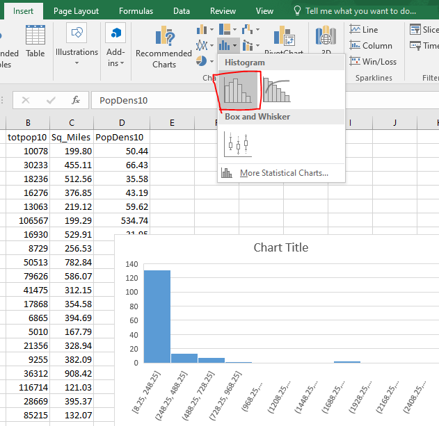
- Insert a histogram
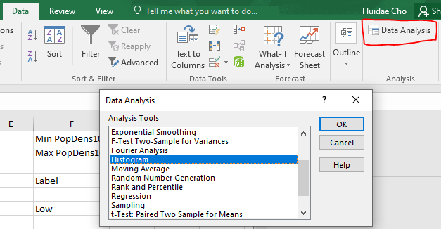
=FREQUENCY()- Data analysis add-in
6.1 Clean up data
- Download Counties_Georgia.xlsx.
- Open it in Excel and enable editing.

- Delete unnecessary columns.
- Select column headers A–D and right click ⇒ Delete.
- Repeat until only NAME10, totpop10, and Sq_Miles columns are left.
- Select all three columns and adjust their widths by double-clicking the border between any two column headers (red line).

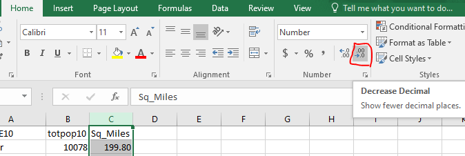
- Decrease decimal in the Sq_Miles column and adjust its width.
6.2 Calculate the population density
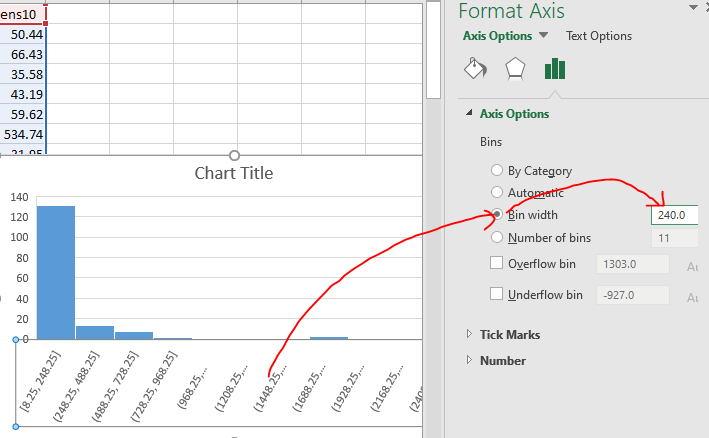
6.3 “Insert a histogram” method
6.4 “=FREQUENCY()” method
- For this method, you need to know the minimum and maximum population densities first.

- Enter “Min PopDens10:” and “Max PopDens10:” in cells F1 and F2, respectively.
- Enter
=MIN(D2:D160)and=MAX(D2:D160)in cells G1 and G2, respectively.
- Enter bins with an interval of 200 starting from 0 up to 2600 in cells G5–G18.
- Enter labels.
- Select cells H5–H19. Yes, select one extra cell past the last bin.
- Enter
=FREQUENCY(D2:D160, G5:G18)and hit Ctrl+Shift+Enter.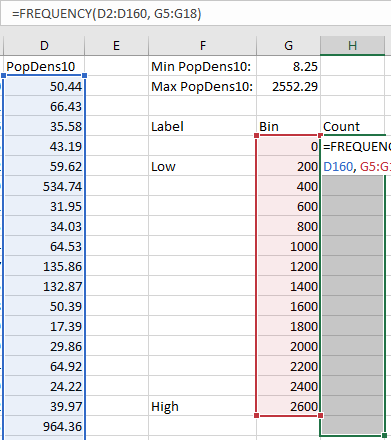
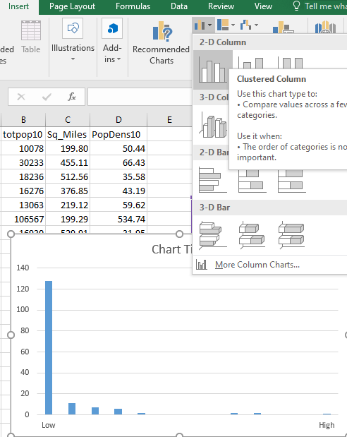
- Select cells F6–F18 and H6–H18. Use Ctrl to select disconnected cell groups.
- Insert ⇒ Charts ⇒ 2-D Column.
6.5 “Data analysis add-in” method
7 Drawing a boxplot manually
- Sort data in an ascending order.
- Add two new columns: Count and Percentile
- For each row, count the number of data points above and in the current row.
- Enter the count in the Count column.
- Divide the count by the total number of rows and multiply it by 100.
- Enter the percentile in the Percentile column.
- Find the middle row if there are an odd number of records. Otherwise, calculate the average of two middle rows. This is the median.
- Repeat the median calculation for the upper and lower halves. They are the 1st (Q1) and 3rd (Q3) quartiles, respectively.
- Calculate the inter-quartile range by subtracting Q3 from Q1. $\text{IQR}=\text{Q3}-\text{Q1}$
- Identify outliers falling outside 1.5IQR from Q1 and Q3.
- Draw a box using Q1 and Q3.
- Draw whiskers using the lower and upper extremes.
- Draw outliers if any.
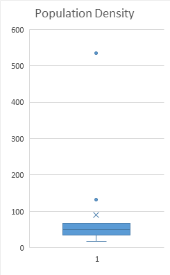
There are different methods for calculating quartiles, but we will use this simple method.
8 Exercise: Manual boxplot
Original data
| NAME10 | PopDens |
|---|---|
| Lanier | 50 |
| Bryan | 66 |
| Appling | 36 |
| Rabun | 43 |
| Bleckley | 60 |
| Fayette | 535 |
| Jefferson | 32 |
| Seminole | 34 |
| Camden | 65 |
| Glynn | 136 |
| Polk | 133 |
| Morgan | 50 |
| Talbot | 17 |
| Schley | 30 |
| Union | 65 |
Sorted by PopDens and calculated percentiles
| NAME10 | PopDens | Count | Percentile | Note |
|---|---|---|---|---|
| Talbot | 17 | 1 | 6.7 | Lower extreme |
| Schley | 30 | 2 | 13.3 | |
| Jefferson | 32 | 3 | 20.0 | |
| Seminole | 34 | 4 | 26.7 | Q1 |
| Appling | 36 | 5 | 33.3 | |
| Rabun | 43 | 6 | 40.0 | |
| Morgan | 50 | 8 | 53.3 | |
| Lanier | 50 | 8 | 53.3 | Median |
| Bleckley | 60 | 9 | 60.0 | |
| Camden | 65 | 11 | 73.3 | |
| Union | 65 | 11 | 73.3 | |
| Bryan | 66 | 12 | 80.0 | Q3, Upper extreme |
| Polk | 133 | 13 | 86.7 | Upper outlier |
| Glynn | 136 | 14 | 93.3 | Upper outlier |
| Fayette | 535 | 15 | 100.0 | Upper outlier |
- $\text{IQR} = 66 - 34 = 32$
- Lower outliers: Below $34 - 1.5\times 32 = -14$. There are no lower outliers.
- Upper outliers: Above $66 + 1.5\times 32 = 114$. Polk, Glynn, and Fayette are upper outliers.
9 Reading materials
10 Homework: Histogram and boxplot
- Create a histogram of Georgia population by county with five labels: Very low, low, medium, high, very high.
- The minimum and maximum are 8.25 and 2552.29, respectively.
- Divide 2600 by 5. That is your bin width.
- Create a new histogram.
- Create two boxplots for 2010 and 2020 Georgia population by county.
- Find the most recent Georgia population data by county. Just google “Georgia population by county” and use the first link.
- Copy and paste this data into a new Excel worksheet.
- Sort by county.
- Copy the 2020 population column into the 2010 population worksheet.
- Calculate the 2020 population density.
- Use the Excel boxplot tool to create two boxplots side by side.
Please submit two separate Excel files:
- Histogram.xlsx
- Boxplots.xlsx
